Key Features of Our Responsive Design
Innovative solutions to ensure your website thrives in every environment.

Mobile-First Design
We focus on creating mobile-first designs that deliver seamless, user-friendly experiences on smaller screens. By optimizing navigation, performance, and accessibility, we ensure your website engages users on the go and adapts perfectly to any device.

Flexible Layouts
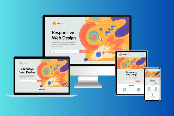
We design scalable layouts that adapt seamlessly to any screen size, ensuring your website looks stunning and functions flawlessly across devices, from smartphones to desktops.
Cross-Browser Compatibility
We ensure consistent and captivating performance across all major browsers, providing a seamless user experience regardless of the platform your audience chooses.
Why Responsive Design Matters
Engaging users on every device is crucial for your brand's success. Our responsive designs ensure that your website offers:
- Enhanced user satisfaction and engagement
- Improved SEO for visibility and traffic
- Higher conversion rates through mobile optimization
- Reduced maintenance and simplified codebase
- Future-proof adaptability for evolving screen sizes
- Broader audience reach through cross-device compatibility
- aster page load times for improved user experience
- Increased user retention with responsive interactivity
What Our Clients Say
"Our site went from mediocre to outstanding with their responsive design. Mobile conversions have doubled!"
- Agile Lifescience Technologies (India) Pvt Ltd"Their expertise in mobile-first design completely redefined how our users interact with our site."
- Kama Jewelry