Overview of Frontend Development
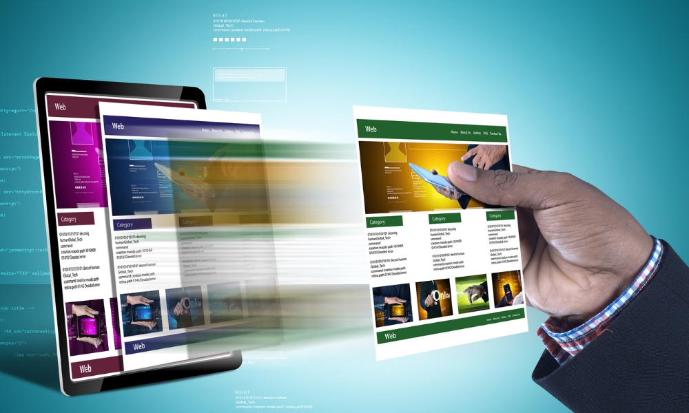
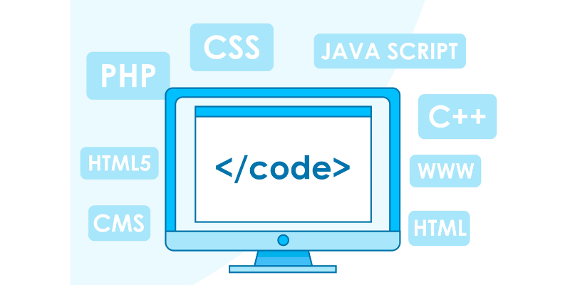
Frontend development focuses on creating the visual aspects and user interfaces of websites that visitors see and interact with. By combining HTML, CSS, JavaScript, and Bootstrap, we deliver smooth navigation, responsive layouts, and engaging elements. Our goal is to ensure usability, design precision, and optimal site performance for a seamless user experience.
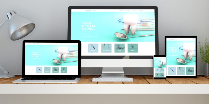
We ensure each design is tailored to reflect your brand’s identity while providing responsive layouts that look stunning on any device. From dynamic animations to intuitive navigation, we focus on creating visually appealing and functional websites that drive user satisfaction. At LookDigitaly, our mission is to turn your ideas into interactive digital experiences that elevate your online presence.
Get a Free UI/UX Consultation with Every Frontend Development Project –
Elevate your business with modern frontend solutions! Our expert developers blend creativity with cutting-edge technology to deliver dynamic, user-friendly websites that adapt beautifully across all devices. From sleek layouts to intuitive interfaces, we bring your vision to life with designs that leave a lasting impact
We leverage the power of Bootstrap's grid system, components, and utilities alongside custom CSS and JavaScript for flexible, responsive web designs. With Bootstrap, we can create complex layouts that adapt seamlessly to any screen size, ensuring your website looks stunning on desktops, tablets, and smartphones. The built-in grid system allows us to structure content with precision, giving us the flexibility to design websites that maintain their functionality and aesthetic appeal across devices. In addition to Bootstrap's pre-built components, we customize elements using CSS to match your brand’s unique look and feel. From buttons and navigation bars to modals and carousels, we can easily tweak and extend Bootstrap's default styles to create a truly personalized experience. Our custom CSS ensures that your website stands out while maintaining fast load times and smooth
Key Features of Frontend Development
Responsive Design
Ensuring a responsive design means creating layouts that adapt seamlessly to all devices, from desktops to smartphones. We utilize Bootstrap's grid system and CSS Media Queries to create flexible designs that adjust gracefully to any screen size.
Interactivity with JavaScript
JavaScript enables dynamic and interactive web elements such as forms, animations, and event-based behavior. Combined with Bootstrap's JavaScript components, we can easily integrate carousels, modals, dropdowns, and more for an enhanced user experience.
Technologies We Use
Our frontend development stack focuses on a combination of HTML, CSS, JavaScript, and Bootstrap to deliver high-quality, efficient, and visually appealing websites.
HTML & CSS

We use semantic HTML5 for structured content and CSS3 for styling, ensuring both accessibility and visually compelling design.
JavaScript

Our use of JavaScript creates dynamic web behavior, enhancing interactivity through Vanilla JavaScript and Bootstrap's JavaScript plugins.
Bootstrap

We harness the power of Bootstrap for rapid, responsive design and consistent UI components that deliver an optimized user experience.
Why Choose Our Frontend Development Services?
- Responsive and Mobile-First Design using Bootstrap's flexible grid system.
- Optimized Performance for faster load times and smooth interaction.
- Cross-Browser Compatibility to ensure seamless performance on all major browsers.
- SEO-Friendly Markup to enhance search engine visibility.
- User-Centric UI/UX design for engaging experiences.
- Continuous Maintenance and Support for keeping your site up-to-date.
Ready to Elevate Your Website?
Contact us today to learn how we can transform your online presence.


Copyright © 2026 lookdigitaly. All rights reserved.